ParentCo. is an online community for parents to find the comfort, courage, compassion, and coping skills needed to raise a child, all while learning how to nurture their best selves.
Project Brief:
Zorzi Creative was tasked with taking the existing ParentCo. brand and expanding it through cohesive design, social media posts, and branding guidelines to use moving forward.
The Challenge:
As a newer company, ParentCo. was just getting started. They had a logo, font, and brand color palette to work with but they needed help growing the brand across their website and social media platforms.
Client: ParentCo.
Date: April 2022
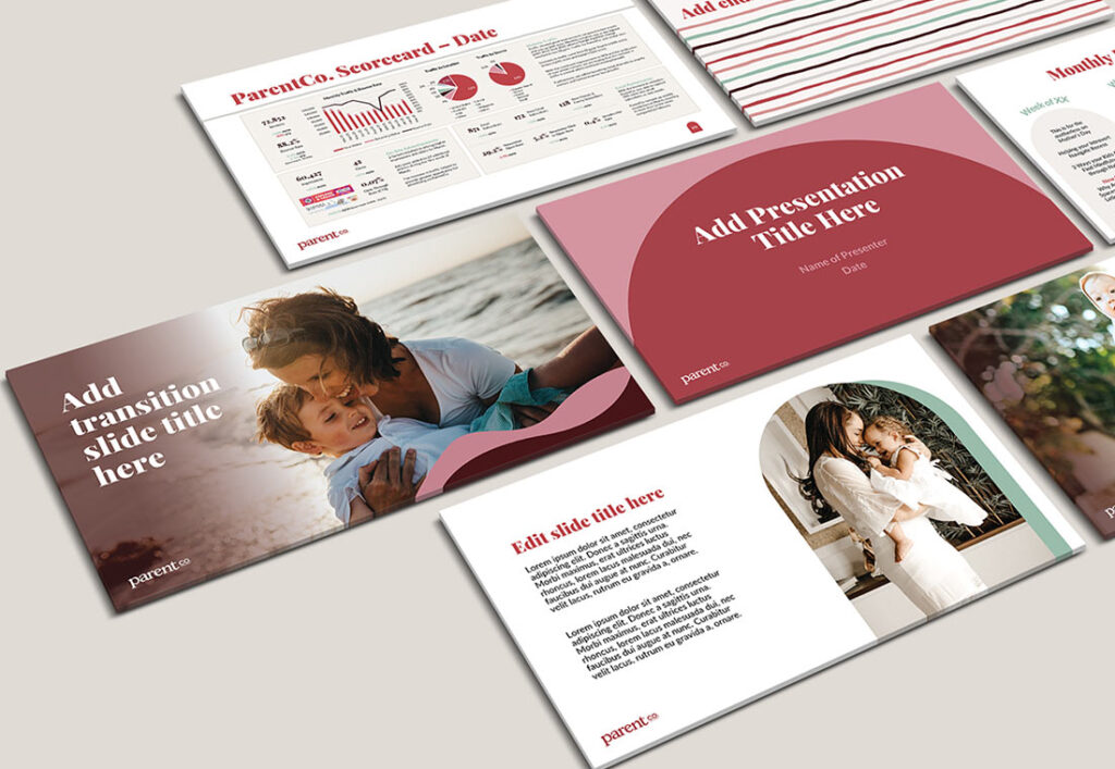
Category: Brand Design, Social Media Design, Website Design
When we first started working with ParentCo., it was important that the design direction we chose was inclusive to all parents– moms and dads; biological and adoptive; single and partnered; and all sexual orientations.
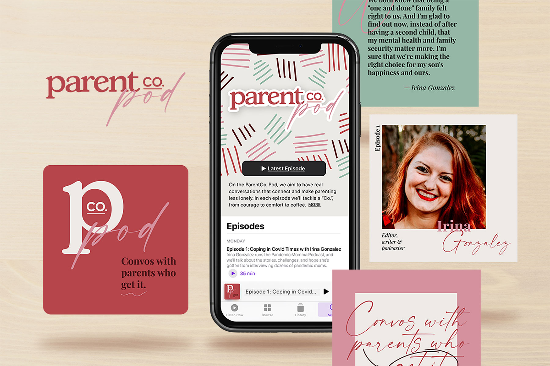
Logo Usage
The single most identifiable element of the ParentCo. identity is their logo. Consistent use of the logo was key to building and retaining brand recognition as we continued to strengthen the design across platforms. We wanted people to be able to recognize the look and feel of ParentCo., across platforms, immediately.
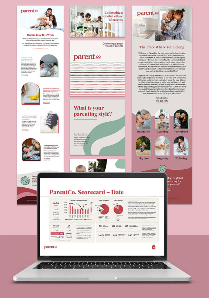
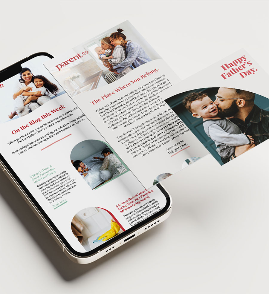
Social media is an important place where we can fully embody the ParentCo. tagline: Connecting a global village of parents. From dynamic Instagram posts to compelling digital patterns, we wanted our graphics to transform everyday moments into special memories by incorporating pops of warm colors and emotionally-charged designs.